The Importance of Responsive Design: Why Your Website Needs to Adapt
In today’s fast-paced world, your website serves as the front door to your business. With an ever-growing array of devices from which people can access the internet—from smartphones to tablets, laptops to desktops—it is crucial that your website can adapt and provide an optimal experience across all these platforms.
This adaptability is where responsive web design comes into play. But what exactly is responsive design, and why is it vital for your business’s online presence?

What Is Responsive Web Design?
Responsive web design is an approach to web development that allows a website to fluidly change and respond to the size and capabilities of the user’s device. Whether someone visits your site from a small smartphone screen or a large desktop monitor, the site will automatically adjust to fit the screen size, orientation, and resolution. This adaptability is achieved through flexible layouts, images, and intelligent use of CSS media queries.
Why Responsive Web Design Is Important?
Improved User Experience
A responsive website offers a better user experience. Users can navigate your site with ease, regardless of their device. This ease of use leads to greater satisfaction, higher engagement, and increased conversion rates. For instance, a retail website that adjusts seamlessly across devices makes it easier for customers to browse and purchase products, directly impacting sales.
Increased Reach to Mobile Users
With over half of global web traffic coming from mobile devices, a responsive design can help you reach a wider audience. A mobile-friendly site is also more likely to retain visitors, as it offers them the convenience of accessing your site anytime, anywhere. For example, a local restaurant with a responsive website can attract more diners by making it easy for mobile users to find their menu, hours, and location.
Better Search Engine Rankings
Search engines like Google prioritize mobile-friendly websites in their search results. Responsive design is a critical factor in search engine optimization (SEO). It can help your site rank higher and become more visible to potential customers, which is particularly crucial for competitive industries where visibility can make or break a business.
Cost-Effectiveness
Maintaining separate sites for mobile and desktop users can be costly and time-consuming. Responsive design eliminates the need for multiple versions of your site, making it more cost-effective in the long run. This consolidation simplifies content management and updates, saving you time and resources.
Future Scalability
Responsive sites are designed to work across current and future devices. This future-proofing aspect means that as new devices (like smartwatches and IoT devices) enter the market, your responsive website is already prepared to meet these new challenges head-on.
The Drawbacks of Non-Responsive Websites
Poor User Experience
Non-responsive sites can frustrate users with tiny text, hard-to-click links, and the need to zoom in and out to read content. This frustration often leads to a high bounce rate as users leave in search of a more user-friendly site.
Limited Reach
You ignore a significant portion of the market by not accommodating mobile users. This limitation can result in lost opportunities, especially for businesses that rely on local search traffic.
Lower Search Engine Rankings
As mentioned, search engines favor mobile-friendly sites. A non-responsive design can lower search rankings, making it harder for potential customers to find your business online.
Higher Maintenance Costs
Running separate websites for mobile and desktop users is an outdated practice and more expensive. It requires more time for updates, double the hosting fees, and potentially twice as many design costs.
Take Action for a Better Website
If your business’s website isn’t responsive, it’s time to make a change. The online marketplace is evolving rapidly, and staying ahead means providing the best possible experience for your customers, regardless of how they access your site. Don’t let your website be the reason potential customers turn to competitors.
Contact us today for a free initial consultation about building a responsive website that looks great and performs exceptionally well across all devices. Let’s work together to create a website that adapts to your business and customers’ needs, ensuring you’re always one step ahead in the digital landscape.
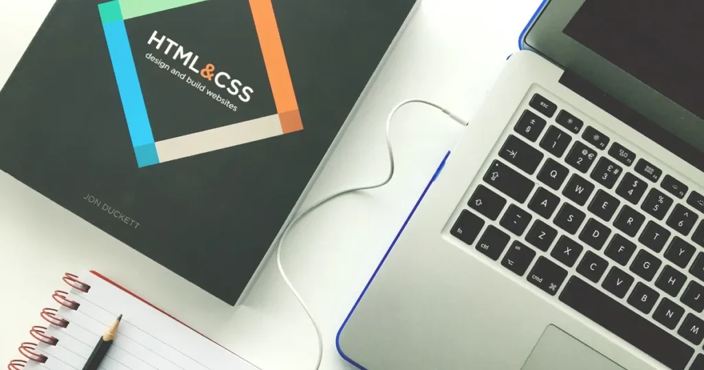
Breaking Down the Benefits of Custom vs. Template Websites
Having a solid online presence is crucial for any business’s success. A website can serve as a place where customers can find answers at any time of day or as an always-open storefront. It is essential to invest in a platform that not only reflects your brand but also attracts and engages potential customers.
When creating a website, business owners often have to choose between using pre-made templates or opting for a custom-designed solution. Understanding the difference between the two and their advantages and disadvantages can help you make an informed decision for your business.
Understanding Website Templates
Website templates are predesigned layouts that allow users to quickly create a website by simply plugging in their content. These templates are readily available from various platforms and come with predefined designs, features, and functionalities.
Benefits of Template Websites
- Cost-Effective: One of the most significant advantages of website templates is their affordability. Since templates are pre-made and readily available, they typically come at a lower cost than custom-designed websites.
- Time-Saving: With templates, you can get your website up and running in hours or days, saving time that would otherwise be spent designing and developing a website from scratch.
- Ease of Use: Website templates are designed to be user-friendly, making them accessible to individuals with little to no technical expertise. You can customize the template by modifying colors, fonts, and images to suit your brand.
Drawbacks of Template Websites
- Lack of Uniqueness: One of the primary drawbacks of using a website template is the need for more uniqueness. Since templates are available to anyone, your website may look similar to countless others online, diluting your brand identity.
- Limited Customization: While templates offer some level of customization, they often come with restrictions on design and functionality. You may be unable to implement certain features or make significant design changes to align with your brand.
- Potential for Bloat: Most website templates come packed with features and functionalities that you may not need. This leads to bloated code and slower loading times, which can negatively impact user experience and SEO performance.
Understanding Custom Websites
On the other hand, custom websites are built from scratch by a developer. They are tailor-made to meet a business’s specific needs and requirements. Every aspect of the website, from design to functionality, is crafted to reflect the brand’s unique identity and goals.
Benefits of Custom Websites
- Unique Brand Identity: With a custom website, you have complete control over the design and aesthetics, allowing you to create a unique brand identity that sets you apart from the competition.
- Scalability and Flexibility: Custom websites are highly scalable and flexible. They can adapt to your business’s growth and evolving needs. You can integrate custom features and functionalities tailored to your specific requirements.
- Enhanced SEO Performance: Custom websites are optimized for search engines from the ground up, providing better control over on-page elements, site structure, and performance optimization, ultimately improving your SEO rankings and visibility.
Drawbacks of Custom Websites
- Higher Cost: Custom-designed websites typically have a higher price tag than template solutions due to the extensive design and development work involved.
- Longer Development Time: Building a custom website from scratch requires time and effort, as every aspect of the site needs to be created and implemented according to your specifications. This process may take longer than using a pre-made template.
- Dependence on Web Development Expertise: Unlike template websites, custom websites require the expertise of web designers and developers to bring your vision to life. This reliance on professionals may entail additional costs and coordination efforts.
Which Should You Choose?
While both template and custom websites have pros and cons, the decision ultimately boils down to your business’s unique needs and goals. While template websites offer affordability and quick deployment, they need more uniqueness and scalability for long-term success. On the other hand, custom websites provide unparalleled flexibility, branding opportunities, and SEO performance, making them a worthwhile investment for businesses looking to stand out in a crowded digital landscape.
If you are hiring a web designer, be sure to ask if they plan to use a template. Frequently, web designers have no experience building a website from the ground up. They rely on templates to build their websites, even though they often still charge as if the design is unique.
At 10T Web Design, we never use templates in our design. Even though every website is built from scratch, we do our best to have competitive pricing when compared to other designers using templates.
If you’re ready to enhance your online presence, contact us for a free initial consultation. 10T Web Design is here to help you build a custom website that reflects your brand identity and drives tangible business results.
James Carnes Center Relaunch
10T Web Design is happy to announce the relaunch of the James Carnes Center Website. The new website features a calendar of events, making it easy to find out if the Carnes Center is available for your event.
Why not head over there now and check it out?
Belmont County Auditor Relaunch

10T Web Design is happy to announce the relaunch of the Belmont County Auditor’s website. While 10T Web Designs has been maintaining their website for a few months, we have now completed the transitions to new the new design. The layout is a reworking of its previous design, updated to more modern web design techniques.
For the Auditor’s website, the font was modernized and enlarged for easier viewing. The front page’s Flash slide show has been replaced with a pure CSS slide show, eliminating the user’s need to have Flash installed and the security risks that come with a Flash installation. The Auditor’s News is now presented in an RSS feed, allowing users to subscribe with a news reader or by signing up to receive the Auditor’s news by email.
The Auditor’s website can be found at belmontcountyauditor.org. Head on over and check them out!
Somerset Primitives Launched
Wanted to take a moment to announce the launch of the Somerset Primitives website.
The latest website designed by us here at 10T Web Design, Somerset Primitives is a full e-commerce website and is integrated with their Facebook page for one-stop news updates and easy user sharing. It also has tiled image galleries and the ability to post from basically anywhere with a smartphone.
Head on over there now and check them out.
It’s a Contact Form, Not a Credit Application
So, tell me your name. Great, and what’s your email address? Awesome. Now, what’s your address, complete with city, state, and zip code? OK, daytime phone? Nighttime phone? Late-afternoon phone? Birthday? Oh, almost forgot, cell phone? Right, and your birthday again was? In what city were you born? Do you use an electric blanket? Electric socks? What’s your stance on beans in chili?
Overly intrusive forms are annoying, not to mention unnerving, to your visitors. After all, they just want to ask you a simple question and, to do so, have to give you their maternal, fraternal, maternal great-great-grandmother’s maiden name. Do you really need to know that?
In a world of Privacy Policies, the more information you require from your visitors, the more information you have to keep private. And, really, do you need five different phone numbers for one person? They just want to know if you have that hand-made scarf in blue.
Keep your contact forms simple, and don’t ask for too much information. Four to five pieces of information is generally enough to get the conversation started, and getting the conversation started is what you want.
Ask for too much information, and chances are the conversation it will never get going.
How Much Is this Going to Cost?
What do you want for it? What’s the damage? How much for this? What’s this cost?
How often do you buy something without knowing the cost ahead of time? Rarely, and when you don’t know the exact cost, you usually have an idea. If you don’t know the cost, chances are you’re not buying. The visitors to your website are no different.
I’ve found that if a website doesn’t at least give the visitor an idea of how much your goods or services cost, the visitor will either greatly overestimate or greatly underestimate the cost. If they overestimate, chances are you’ll never even hear from them. If they underestimate, chances are they will be shocked by your price when you make your pitch, and you’ll be wasting both you and your visitor’s time.
Even if they have done some research on the going rate, chances are they found that information out from one of your competitors. I don’t think I need to explain how horrifying that is.
I can already hear the service providers out there saying something about how the cost of your service is really dependent on what your client wants and each client wants something different.
I’m a web designer. Trust me, I know.
Still, you should be able to give potential customers an idea of what it’s going to cost them to get their project completed, and if costs can vary greatly, say so on your website. It’s better than saying nothing at all and leaving your visitors guessing.
Or looking up the costs on your competitor’s website.
Keep Your Website Focused
Staying focused on your purpose is important. Your website has a purpose, too, and it’s just as important to keep your website focused. Different websites can have drastically different purposes. Individual websites can even have multiple purposes, provided that they do not conflict with one another.
Website fluff comes in all shapes and sizes, and what’s fluff on one website could belong on another. Before you have anything put on your website, first define your website’s purpose. Then ask yourself if what you want to put on you website helps carry out that purpose. If it does, great. If it doesn’t, either change the purpose of your website, or leave the content off.
Look, I know that cat picture you have is cute and all, but does it serve your website’s purpose? If you run a veterinary clinic, that cat might just be the thing missing from your website. If you run an electronics store, you probably should leave the cute little kitty on your hard drive.
Unless, of course, one of your employees helps place homeless cats in her spare time and this is the 1,000th cat she’s help find a loving home and you want to congratulate her on her continued efforts in the humane treatment of felines. Hey, it doesn’t always have to be about direct marketing.
Just make sure what you put out there falls inside the borders of what you want your website to do. If it doesn’t serve the purpose of your website, it doesn’t belong on your website.
Don’t Hide From Your Visitors
Websites are, inherently, a very public thing. Anyone in the world (barring local filtering) can see your website. It’s enough to make many queasy thinking about people on the other side of the world having access to their phone number or, brace yourself, their email address.
Exposing your email address on a website does open you up to spam emails, but these days, many businesses have catchall email addresses anyway. If you have a catchall email address, the “I don’t want to get spam email” argument is already invalid.
Personally, I’m a bit of an on-line privacy nut. And with that said, hiding your business address and phone number has never made sense to me, since anyone can find the information on any number of government and yellow-pages-type sites.
If it’s on your business card, put it on your website, and make it easy to find. If your address, email, and phone number are not on your business card, it might be time to redesign those as well.
Hiding your business’s information usually only hides it from the people you want to have it: your website’s legitimate visitors. Not to mention that it leaves the impression that you have something besides your address to hide.
It’s OK to Speed (On-line)
In the real world, they put up big reflective signs that tell you how fast you are allowed to go. In the digital world, no such signs exist. Like a top fuel dragster on a quarter-mile strip, the speed of the Internet is only limited by the equipment and techniques you use. Also just like the dragster, faster is better.
At best, a slow website frustrates your visitors and prevents them from trusting you. At worst, they leave before the page even loads. Website load times depend on a variety of factors, only some of which are under your control.
Don’t go super-budget when you decide who is going to host your website. I’m all for saving a buck, providing that you’re not sacrificing quality hosting to save a couple dollars a year. If just one potential customer doesn’t get frustrated with your slow website and ends up buying from you, then you’ll easily pay for the better hosting.
Make sure that the design of your website is current. Websites that use outdated technology only get slower with time, and will sometimes stop working completely if the technology becomes deprecated. Be wary of web designers that only offer a limited maintenance period, as web technology advances pretty quickly.
Another heavy hitter is the size of the images on your site. Doubling the image size in each direction actually quadruples the size on disk (and in transit), so that an image that might take a half a second to load now takes two seconds. Double the size again, and it’ll take eight seconds.
Bottom line: keep it speedy. Don’t lose your website’s visitors before they even see your website.